Terminal Visualizer
February 10, 2025
It would be nice to know what, exactly, fowl is doing while it is connected.
Let us entertain the user with visualizations of status and bytes transmitted over subchannels!.
Some Data (Yak depth: 🐃🐃🐃🐃🐃)
Before starting to visualize a thing, we need some things to visualize.
For fowl specifically, that means its current state. Here I mean “state” in the wide-ranging sense of “everything that’s going on”: connection status; peer status; listeners; connections; data transferred; etc.
Currently, the code is factored such that a “core” accepts commands (corresponding to messages in the protocol spoken to a supervisor process). It also emits status messages (also corresponding to the supervisor-process protocol).
Internally, these are represented as @attrs.frozen message classes. These are directly translated to and from JSON for the frontend protocol.
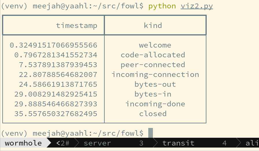
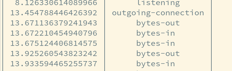
So, if we save a bunch of those messages, we have a dataset. Yak shorn.
Learn a Terminal Thing (Yak depth: 🐃🐃🐃🐃)
To make a fun terminal visualization we probably want something besides “do it by hand” these days. One fun-looking new thing is Textualize – let’s try it!
Now, we can take our data and test out some visualizations – that is, see how it looks. Having the data is great, because we can change the visualizer a little and easily see how that affects output. It also lets us test against real-world use-cases without having to “really use it in the world” all the time.
(Oops, had to add timestamps to the data – now we get the number of seconds since start in each message so we can simulate properly. Bonus 🐃!)
Okay so the “clock.py” example looks simple; we shall start with that!
🐇🕳️ What Even Is Bandwidth? (Yak depth:🐃🐃🐃)
Okay, so when fowl does stuff, it gets “a message”. We know how many bytes each one is, so we can compute the “network activity” somehow!
However, we are missing some information: how long did the message take to .. arrive?
This is kind of a deep and complicated question. At the level of Magic Wormhole, it could record timestamps when Twisted calls dataReceived() (which is how Twisted informs Magic Wormhole that it got some bytes). Magic Wormhole is (often) buffering several of these up before it has gotten “a message”.
However, Twisted itself is also possibly buffering things. The operating system, similarly, could also be buffering things. And the actual hardware itself is buffering as well.
If all that sounds like a lot of “buffering”, you’re right! And there’s even a term for what happens when this goes wrong: Bufferbloat.
Another way of saying all that: having accurate numbers is hard!
Right at the moment, I don’t care precisely how accurate our packet timing information is, or if we’re hyper accurate with this visualization – we’d like to make our best effort.
Bandwidth is bytes per second.
Regardless of which layer we got numbers from, we never actually know how long each bit takes to transmit. Following this logic higher, all we’re saying is that when estimating bandwidth the information we have at our disposal is something like, “ending at timestamp T, we received B bytes of data”.
It is usually the case that we have these pieces of information fairly frequently and thus can infer things like “in 2.3 seconds we received 150bytes of data”. This is the sort of thing we need to make up “bandwidth” numbers.
Before we get too far down this rabbit-hole, though, we just want to show the user something fun when messages arrive. What we do know, without changing networking toolkits and other libraries:
- how many bytes are in a message;
- and when it arrived (i.e. when Magic Wormhole stopped receiving it)
So already we can do something!
Make The Terminal Do A Thing (Yak Depth: 🐃🐃)
Step zero: make textual do a thing.
Okay, scratch that: Textual is too complicated for this, we’re using Rich.
Looking quickly at the examples, we want a Live panel. So we can load some data, and do at least something with it now:
Yay! We did a visualization! Note precisely as far as something interesting with bandwidth but …
Collect Better Data (Yak Depth: 🐃)
So the “demo” data is a little boring: we just send a few bytes each way and quit.
I want something a little more exciting; how about rsync over Wormhole? Hmm, that’s several steps of setup – ssh is easier, since I usually have it ready to go when working remotely.
Distraction: a tool to shorten the “boring stuff” of connecting etc.
Visualize a Terminal
No more Yaks!
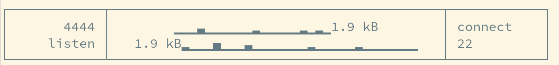
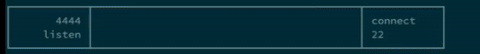
We can write a simple visualization, including bandwidth. The method is straightforward: for some interval (e.g. half a second or a second), collect any “bandwidth” events in that interval. Show newest first; this makes it seem like the packets are “flowing” across the screen.
To show “a bandwidth” event, we use a rather arbitrary scale of the unicode “block” characters. These give us 8 breakdowns. The first is for “0” bytes; then < 100; then < 1000; etc and the last two go a little more giving 1MB and 100MB.
I would like the above to be a nice little animation .. but my laptop is running Wayland and my goto for recording is Simple Screen Recorder, which doesn’t like Wayland. So that would be far too many 🐃’s before posting this :)
Okay, that Yak got shorn on my desktop.
If you would like to stare into the abyss, you may see the actual visualization proof-of-concept code.